Featured projects.
Real work. Zero fluff. Sites I have built to captivate visitors and grow businesses.
Project 1
Arclo Design
E-commerce and brand presence for 3D-printed designer lighting.
Dynamic product pages
Shoppers want to see the product in action. We integrated fluid video and high-res galleries that show off the lights in real spaces, without tanking the site's load speed.
Verified reviews
Social proof is everything. We built a rating system right into the product pages to give buyers immediate confidence before they click "Add to Cart."
Minimalist e-commerce experience
Cluttered stores kill conversions. We designed a minimalist navigation flow that keeps the spotlight strictly on the product, removing every possible distraction from the checkout process.
High-performance visuals
Heavy images usually mean slow websites, but not here. We used next-gen compression and lazy loading to keep everything blazing fast while looking razor-sharp.

Project 2
Spindl
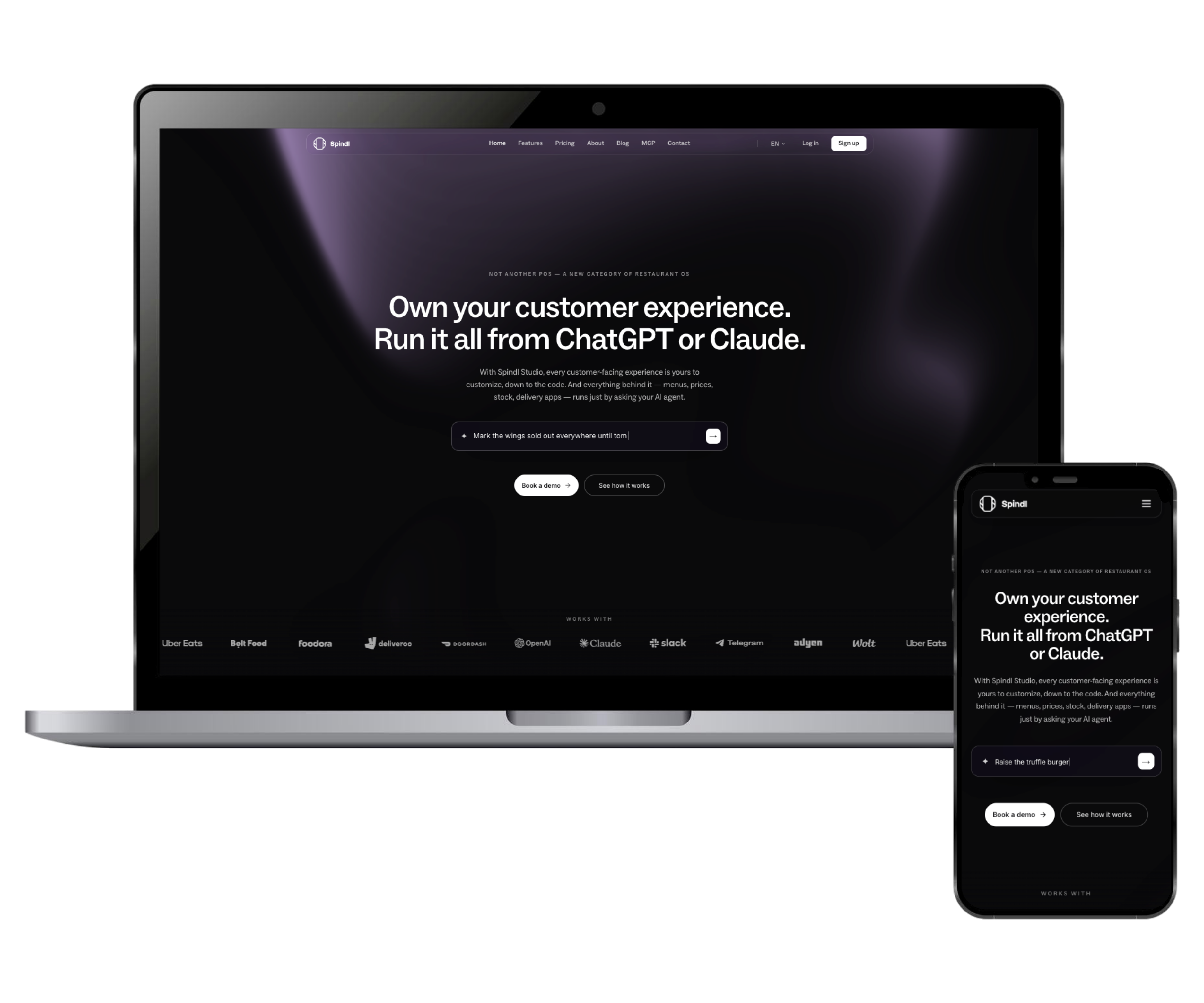
Corporate website for a restaurant management SaaS (POS).
Interactive AI Demo
Instead of just telling them how good the software is, we let users play with it. A real-time simulation module lets visitors test predefined questions to see exactly how the integrated AI responds.
Glassmorphism Navbar
A sleek, frosted-glass sticky header that stays out of the user's way. It keeps navigation easily accessible without clashing with the content underneath.
Multi-language architecture
Built to scale across borders. We integrated a clean, native language switcher so the platform can effortlessly expand into international markets.
Estética tipográfica audaz
B2B software sites shouldn't be boring. We used high contrast, sharp typography, and plenty of white space to give the brand a premium, modern tech feel.
Project 3
Art De Sun
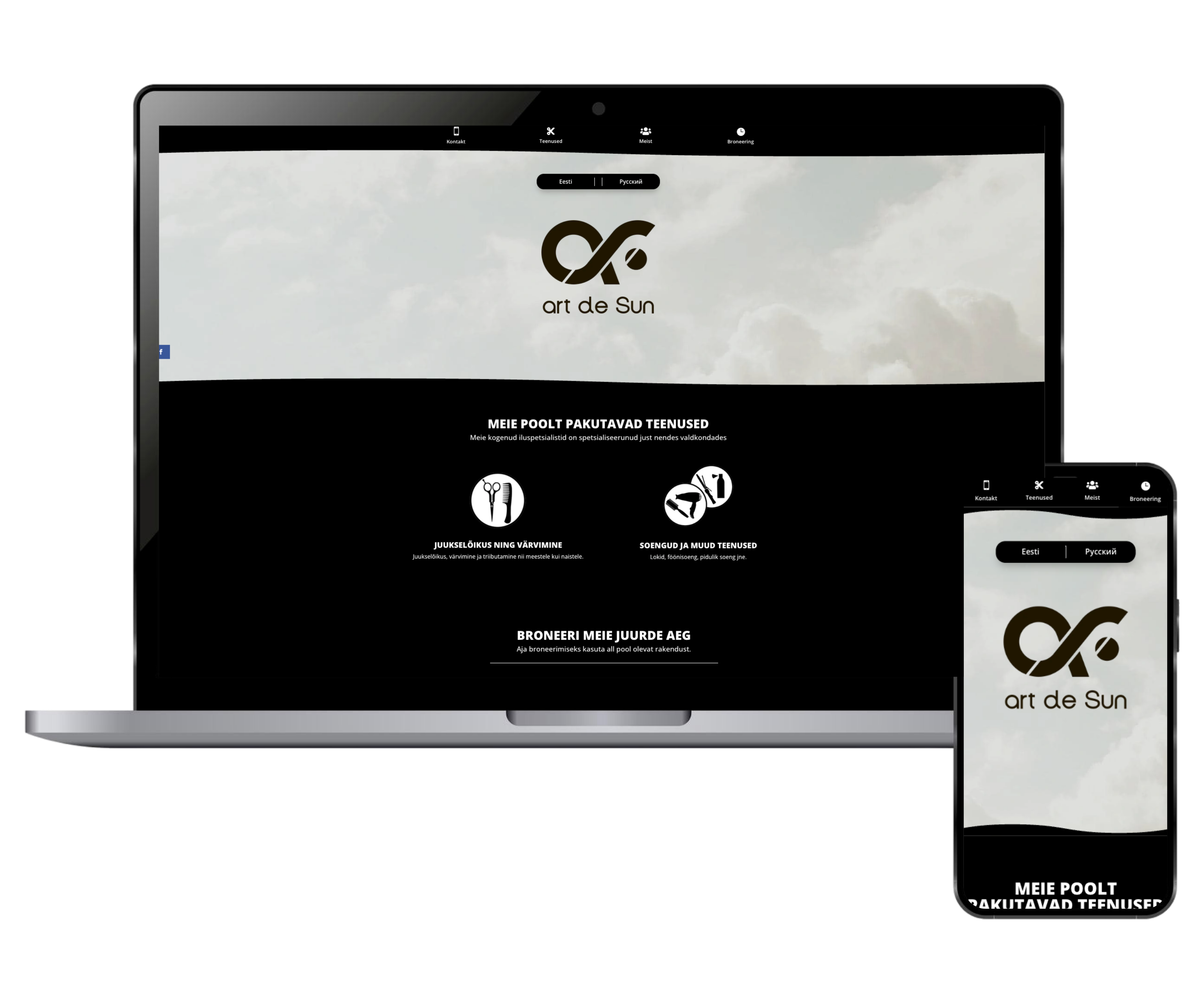
Website and booking portal for a high-end hair salon.
Seamless booking system
Because nobody wants to call in anymore. We built a direct booking form letting clients pick their service, date, and time in just a few clicks.
Intuitive service routing
Clear, distinct pathways for men's and women's services, ensuring clients find exactly what they are looking for without digging through a massive menu.
Editorial art direction
A luxury physical space deserves a luxury digital presence. The clean, editorial-style layout perfectly mirrors the high-end experience clients get the moment they walk through the salon doors.
Zero-friction contact
Location, hours, and contact methods are front and center. No hiding the essentials - everything is immediately accessible whether they are on a phone or a laptop.
Project 4
Blendent
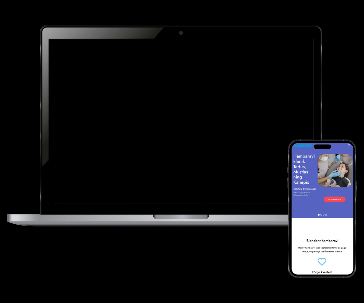
Clear, reassuring landing page for a dental clinic.
Interactive hero slider
A dynamic top section showcasing the clinic’s modern facilities and medical specialties to immediately build trust right above the fold.
Calming digital interface
Let’s face it, going to the dentist makes people anxious. We designed a hyper-clean, readable layout specifically meant to generate a sense of calm and professional safety.
Super clear treatments
We stripped away the confusing medical terminology. The dental services are broken down in simple language, so patients actually understand what they’re signing up for.
Strategic appointment prompts
We placed quick-booking buttons at natural conversion points throughout the page, making it ridiculously easy for new patients to secure a spot.
Project 5
Treileriveod
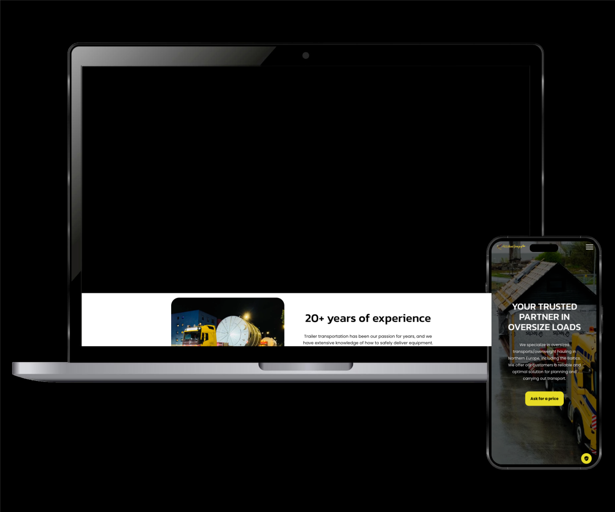
Corporate site for an international heavy transport and firewood supplier.
Custom quote engine
We built a tailored online inquiry system that adapts to the user, allowing them to request accurate freight rates based on specific cargo types and routes.
Fleet & logistics showcase
In heavy transport, seeing is believing. A robust visual gallery documenting massive hauls and special projects provides immediate proof of their logistical firepower.
Smart business splitting
Hauling heavy machinery and selling firewood are two distinct services. We created clear funnels for each, preventing user confusion and keeping leads neatly organized.
Cross-border localization
Built to handle clients across all of Europe, the site's multi-language structure ensures smooth communication regardless of where the freight is headed.
Project 6
New York Pizza
NY-style pizzeria with an integrated loyalty and ordering system.
"NYP Friends" loyalty hub
A fully integrated signup form designed to capture user data in exchange for exclusive promos, turning one-time buyers into regulars.
Frictionless courier links
Seamless, optimized handoffs to third-party delivery apps like Wolt and Bolt Food, making sure hungry customers can order instantly without getting lost.
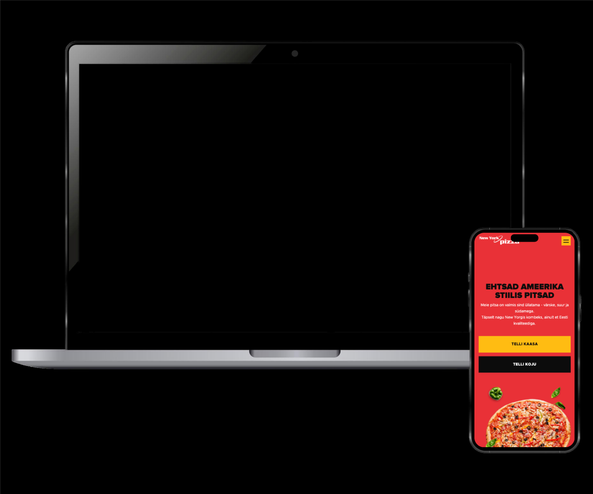
Crave-worthy visual menu
People eat with their eyes first. We structured a highly visual, intuitive menu that uses mouth-watering product imagery to speed up the ordering decision.
Raw urban aesthetic
We bottled the restaurant’s physical vibe and put it on a screen. The design is bold, direct, and packed with authentic NY-style attitude.
Project 7
Work Time Manager
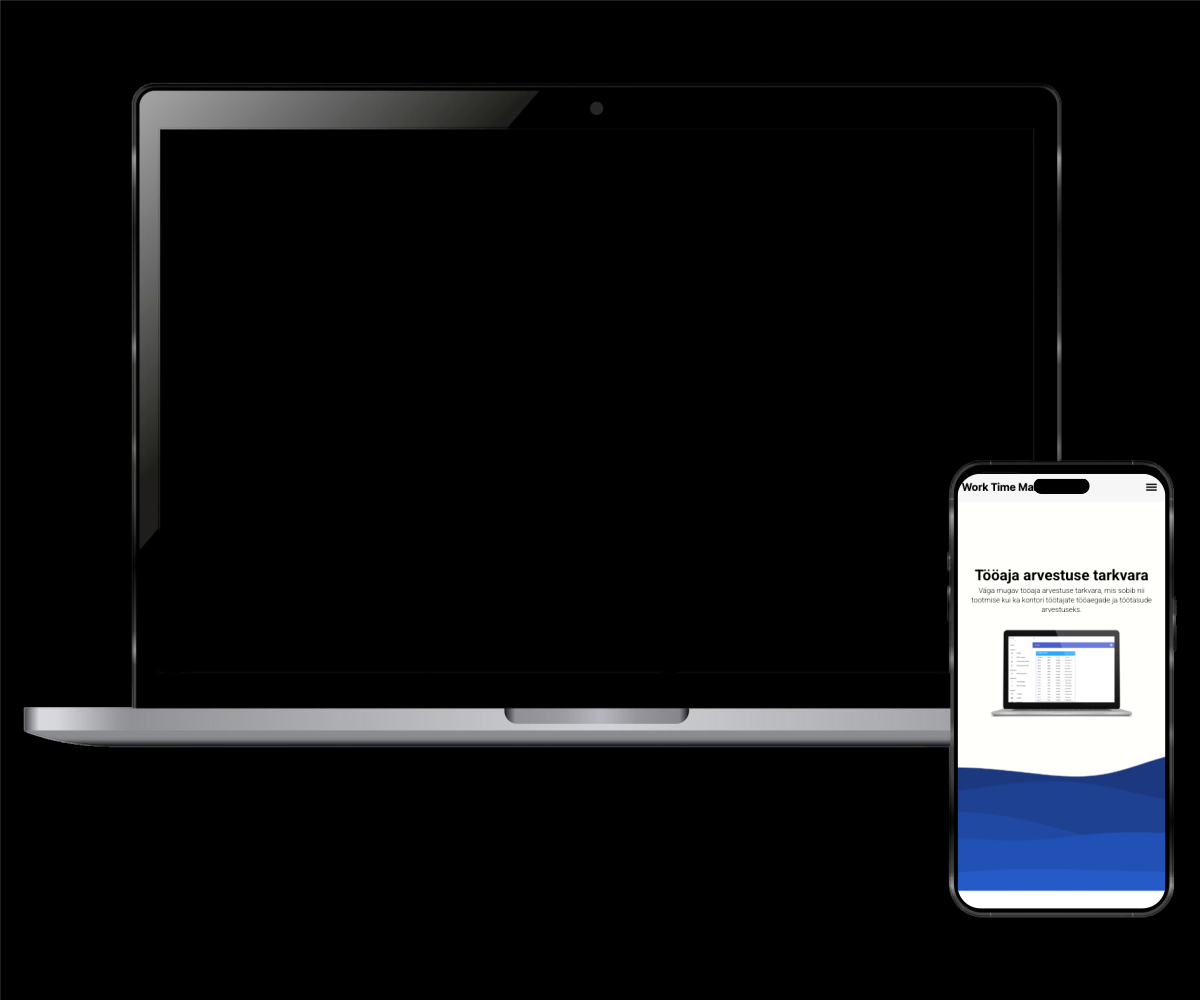
Corporate site for a time-tracking and payroll SaaS.
Native video demos
We ditched clunky external players (like YouTube or Vimeo embeds). Features are showcased via lightning-fast, locally hosted videos that keep the user on the site.
Persona-driven architecture
The site's flow smartly splits the narrative, speaking directly to office managers in one section and production teams in another, so everyone gets the pitch tailored to their specific needs.
Jargon-free mechanics
Payroll tech can be incredibly dry. We broke down exactly how the software calculates hours, shifts, and salaries using plain, easy-to-digest language.
Laser-focused UI
A highly functional, minimalist design that strips away the fluff. It’s built entirely around usability, ensuring potential clients understand the tool's value the second they land.